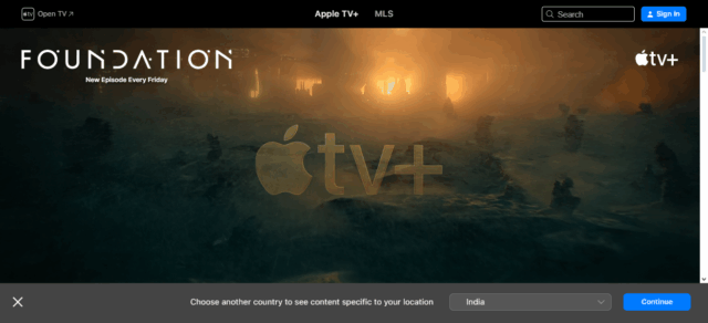
In this article, I will cover the Best YouTube Thumbnails For Higher CTR and how these techniques can drastically change the performance of your video through minimal design changes.
You will understand the mechanisms of top creators and their use of striking text, facial expressions, contrast, curiosity, and other techniques that capture attention in overflowing YouTube feeds.
key Points & Best YouTube Thumbnails For Higher CTR List
| Thumbnail Strategy | Key Benefit |
|---|---|
| Bold, Readable Text | Instantly communicates the video’s value |
| Close-Up Facial Expressions | Creates emotional connection and grabs attention |
| High Contrast Colors | Stands out in the feed and draws the eye |
| Tease the Story (Not Spoil It) | Sparks curiosity and encourages clicks |
| Consistent Style & Branding | Builds channel identity and trust |
| Use of Arrows, Circles, or Emojis | Highlights key parts of the image |
| Shock or Surprise Elements | Triggers intrigue and reaction |
| Before & After Comparison | Visualizes transformation or result |
| Thumbnail & Title Synergy | Reinforces messaging and clarity |
| Minimal Text with Powerful Visuals | Keeps it clean while still grabbing attention |
10 Best YouTube Thumbnails For Higher CTR
1. Bold, Readable Text
The text on your thumbnails should convey the main point of the video, best achieved through bold, large font. Given that most YouTube users use mobile devices, the text accompanying the thumbnail needs to be big, contrast with the background, and limited to four words.
Capture feelings tied to the video with the text, like “BIG Mistake,” “Epic FAIL,” or “Easy Fix.” Accompany the text with fitting imagery.

Avoid fonts that are too artistic and challenging to read. Viewers competing for attention with countless other thumbnails on the screen, compelling captions will spark interest.
| Feature | Description |
|---|---|
| Large Font Size | Easily readable even on mobile screens |
| High Contrast with Background | Improves visibility and draws attention |
| Few Words (Under 4) | Communicates quickly without clutter |
| Simple Fonts | Avoids complex or decorative fonts |
| Action Words | Engages viewer with dynamic language |
2. Close-Up Facial Expressions
The importance of faces in human communication cannot be underestimated since the use of smile, frown, or any expression draws attention instantly. These emotions give viewers an emotional response, whether it is surprise, joy, fear, or even confusion.
Often, thumbnails with expressive faces outperform generic ones or text-only designs becuae they add a human touch to the video, fostering understanding and connection. Ensure that the image is sharp and well-lit, focusing tightly on the face.
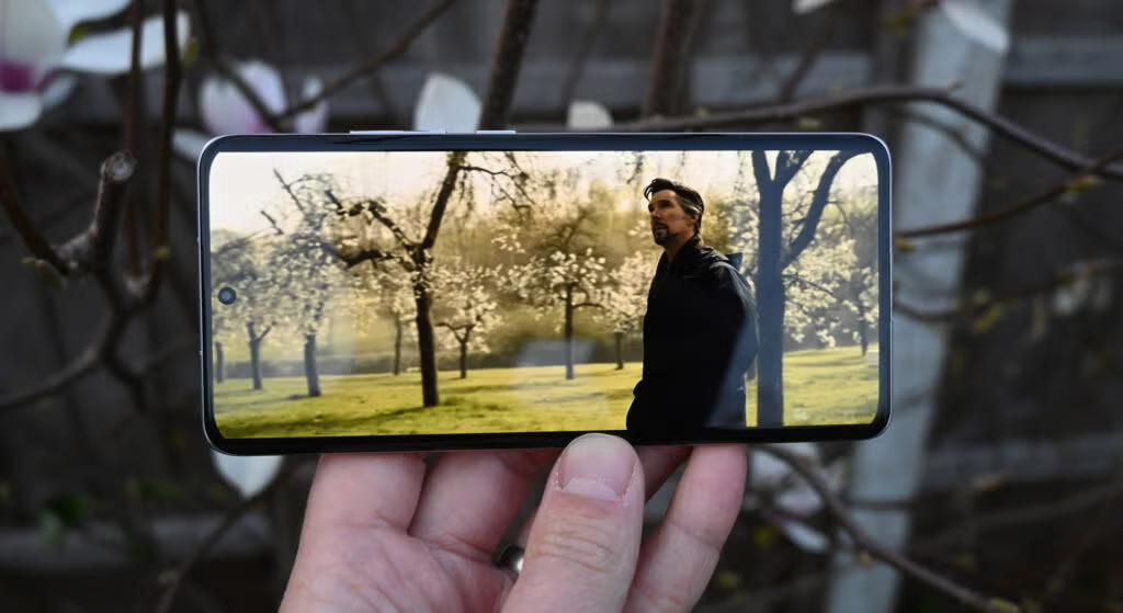
Reaction shots are extremely powerful in tutorials, challenges, and storytelling content. Even when the creator isn’t visible in the video, using a face related to the theme resonates strongly with the content and boosts CTR dramatically.
| Feature | Description |
|---|---|
| Tight Crop on Face | Focuses on emotion and eye contact |
| Exaggerated Emotions | Amplifies viewer engagement and curiosity |
| Sharp Image Quality | Keeps the expression clear and impactful |
| Bright Lighting | Enhances facial features and visibility |
| Authentic Reactions | Builds trust and relatability |
3. High Contrast Colors
High contrast colors are essential in making thumbnails prominent due to the oversaturated nature of Youtube. Attention grabbing thumbnails usually utilize red and yellow, blue and orange as well as white text on dark backgrounds because they increase visual appeal.

The aim is to ensure your video stands out even at a glance. Use color carefully by keeping color theory in mind—contrast the background from the subject or text to create focus.
Avoid oversaturating your graphics with cheap colliding colors. Prominently placed colors that work well in unison can help create energy, urgency or even clarity in the video, and improving click through rates.
| Feature | Description |
|---|---|
| Complementary Color Pairs | Colors like red-green, blue-orange create visual tension |
| Bright Tones | Pops out in dark-themed YouTube backgrounds |
| Contrasted Text Elements | Text color differs sharply from background |
| Color Blocking | Divides areas to highlight subject and message |
| Visual Depth | Enhances focus by layering contrasting tones |
4. Tease the Story (Not Spoil It)
Every great thumbnail is intriguing without revealing too much. Teasing the narrative plays an essential role in ensuring a viewer clicks for more. For example, if a makeover is the highlight of the video, you could showcase the “before” image and blur the “after”.

In challenge or transformation videos, make sure not to reveal the main result or punchline. You could add a layer of mystery with question marks, zooming in, or partial reveals. The ideal thumbnail pulls viewers in with questions waiting to be answered.
| Feature | Description |
|---|---|
| Partial Reveal | Shows just enough to create mystery |
| Blurred or Hidden Details | Obscures outcome to increase curiosity |
| Visual Hints | Includes props or expressions as story clues |
| Question Marks | Suggest an unanswered question |
| Intriguing Setup | Sets up a situation that demands a follow-up |
5. Consistent Style & Branding
Your audience will appreciate the trust built when there are repeating styles. Having a consistent thumbnail contributes to visual recognition; your audience can track your videos easily.
With regard to shape, logo, font style, or color scheme, all of them can be termed as branding and repeating them helps with brand identity.

Even in a saturated feed, viewers are able to identify your content at once. This trust improves channel loyalty as subscribers have a greater willingness to come back for fresh uploads.
Readers are separated from professional creators, allowing him or her to stand out. Consistency makes templates easy but use them judiciously. Thumbnails should not become monotonous, consistency should not obstruct fresh branded formats.
| Feature | Description |
|---|---|
| Branded Colors | Same palette used across all thumbnails |
| Repeated Layout | Familiar composition builds visual identity |
| Logo or Icon Inclusion | Reinforces channel recognition |
| Font Consistency | Reuses same font family and size |
| Thematic Visuals | Matches content genre (tech, beauty, education, etc.) |
6. Use of Arrows, Circles, or Emojis
Adding circles, arrows, or emojis strategically on a thumbnail can help direct attention to certain areas but also evoke curiosity. Like with emojis, arrows can be suggestive of a fun and exciting secret detail that is hidden while circles are used to draw focus to the most important areas.
They are very helpful for context and visual appeal, especially for a younger demographic. The elements listed act as hints and cues and when merged work as wonderful pointers about the focus the video is.

It is, however important that these emojis and arrows be used in moderation—so as not to clutter the thumbnail or make it clickbait. If used correctly, these tools work wonders at CTR and engagement. This directs attention while reinforcing the messages highlighted in the videos.
| Feature | Description |
|---|---|
| Directional Arrows | Points viewer attention to key part of thumbnail |
| Circles or Highlights | Emphasizes focal elements in image |
| Relevant Emojis | Adds tone or emotion quickly |
| Limited Use | Used strategically, not overdone |
| Visual Emphasis | Makes thumbnails feel dynamic and guided |
7. Shock or Surprise Elements
Corel’s Graphic Suite suggests to use an image that has an element of shock that can grab the viewer’s attention for your thumbnail. Be it an unusual reaction, a strange object, or an out-of-context situation – all these elements provoke a certain level of interest and fascination to want to delve deeper.
This approach is perfect when it comes to challenge videos, pranks, storytelling, or extreme transformations. It’s always essential to get the right shock value for your audiences’ expectations because misalignment can adversely impact retention rates.

Try to evoke genuine surprise rather than the predictable fake click-bait. The burst of CTR and attention from viewers that your thumbnail provokes can come from well-placed moments of astonishment like “what just happened?”.
| Feature | Description |
|---|---|
| Unexpected Visual | Includes something strange or out of place |
| Surprised Reactions | Human faces showing disbelief or awe |
| Bright, Focused Imagery | Draws instant attention with contrast and clarity |
| Unusual Objects/Scenes | Triggers curiosity through confusion or suspense |
| Real, Not Misleading | Thumbnail matches actual content to retain viewer trust |
8. Before & After Comparison
The “before and after” selfie style thumbnail has proven to be a classic and most successfully performing style due to its ability to solve a one-step transformation puzzle. It works well for the niches of fitness, home renovation, makeovers, and tutorials.
People are inherently interested in change and this format promises it. Ideal versions of this format make certain that the difference between the two photographs is striking, whether through lighting, colors, facial expressions, and so on.

Add a dividing line or arrow to indicate the two states. This strategy provides a compelling reason to click, as viewers want to find out what steps or what story led up to the transformation that was achieved.
| Feature | Description |
|---|---|
| Split Screen Layout | Clear visual separation between “before” and “after” |
| Visual Transformation | Highlights dramatic change in look, design, or state |
| Contrast in Image Style | Shows progression through lighting, posture, or color |
| Dividing Line or Arrow | Indicates direction of change |
| Consistent Background | Keeps focus on subject by maintaining scene consistency |
9. Thumbnail & Title Synergy
Every aspect of your thumbnail and title, which is a single sentence, needs to be in sync to create a harmony that works towards garnering a click.
A vague title would require a thumbnail that captures the essence of the video, whereas a specific title would require a thumbnail that provides candid context to the video.

You should avoid repeating the same sentences with slight variations—let the thumbnail add something new.
As with the example of a title “She Said WHAT?!” which gets this spammed thumbnail” shocked face. Enhanced text and imagery provoke interest while providing enough context to make a fast decision. This coupling is key to optimize CTR.
| Feature | Description |
|---|---|
| Complementary Messaging | Thumbnail and title support the same core idea |
| Avoids Repetition | Visuals and text add different layers to the story |
| Emotion + Context | One gives feeling; the other gives clarity |
| Unified Tone | Both elements match in mood (funny, serious, curious) |
| Engaging Pairing | Encourages clicks by offering both context and intrigue |
10. Minimal Text with Powerful Visuals
Thumbnails should never be cluttered. Using as little text as a few words makes sure that the imagery is the one doing the talking. Text should be left out as much as possible and extremely captivating images should be used instead.
A photograph has greater impact than words, and so does a symbol. When text is too dominant, it loses its meaning, especially when it is viewed on a smaller screen.
Thumbnails that blend few powerful words together with images are more effective in delivering the intended message which makes the thumbnail increase in attractiveness. The image presented should intrigue and stir emotion within the viewers without bombarding them with words.
| Feature | Description |
|---|---|
| Fewer Words | Avoids overload, stays readable on small screens |
| Clean Composition | Plenty of open space, uncluttered layout |
| High-Impact Image | Strong visuals tell the story without needing extra words |
| Emotional or Visual Hook | The image alone creates a desire to click |
| Strong Subject Focus | Single clear point of attention (person, object, action) |
Conclusion
To sum up, the best YouTube thumbnails which increases CTR require a balance between artistry and marketing as bold text, vibrant types, and strong contrasts capture attention while brand-aligned teasers encourage clicks.
Thumbnails and titles working in unison, powerful yet minimal visuals, and clean typography make your content irresistible, enhancing overall channel growth, views, and engagement effortlessly.


